This entry originally appeared on my disability blog, I hate stairs.
After twenty-four years of life, eighteen years of education, and one summer of unemployment, the result is an underwhelming product: an MBA who loves a field for which he did not go to school, has been thrown into a world of economic hardship, and is confined to a state in which ten percent of people willing to work do not have jobs.
Oh, and I redesigned the blog.
I would like to thank Lucian Marin for his wonderful Andrea theme, which I have used for just over a year. I discussed the beautiful WordPress theme more in my post entitled “Needless theme change.” This new theme change is arguably more needless than the last. It was more about scratching an itch than anything. I’ve wanted to have my own design as long as I have had this blog. In the beginning, I opted for getting a jump start as opposed to designing a blog theme first. I was eager to write! But that eagerness was recently overshadowed by the lacking feeling of incompleteness. And so I have taken it upon myself to fix the situation. To balance my yin and my yang.
Introducing the official “I hate stairs” theme, creatively dubbed IHS. I originally set out to create a sort of backward, upside down, or otherwise crazily unique layout while still coming off minimalist. But what I ended up doing was not particularly mind-blowing. It’s just a regular old blog layout. But regular blog layouts work. They have become a convention (or a lull, perhaps). Try taking everything out of the sidebar and putting it somewhere that doesn’t look like a sidebar. Difficult. I did manage to pull off a few interesting stunts, however.
I tawt I saw a gwid!
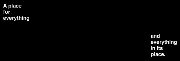
That’s right. I built the layout on a 12-column, 940-pixel grid with a 21-pixel baseline. If you have no idea what that means, click this switch to toggle the grid. Note, however, that not all elements will line up perfectly. I have only thoroughly tested the grid in Firefox. If you are using Internet Explorer, some page elements might be way off. To my knowledge, the blog should look fine in IE6 and higher, but my testing was limited. But for most folks, the grid provides some structure and pays respect to the old saying “a place for everything, and everything in its place.”
My images are bigger than yours

The idea behind letting images break out of the normal reading area is to throw in some tension and shake things up. It’s like when your preacher suddenly yells out a powerful declaration and kicks you out of your daze (it is usually followed by an amen). I have to insert a disclaimer here. I don’t know if all this image trickery will work in specific versions of Internet Explorer, so I apologize if it is a mess. I do plan to do some more thorough testing.
What will our hero do now?
Enough about the design. Let me fill you in on what’s going on with me. I figure my difficulty finding a job in Web design stems from our crappy economy and the fact that there aren’t as many jobs in Mississippi as other locations. Nonetheless, some exciting developments are taking shape. First, I’m laying the groundwork for forming an LLC through which I will do professional Web design work. Second, in order to gain experience and help out the community which has helped me so much, I’m planning a “project” through which I will offer free Web design services to charitable, non-profit organizations based in Mississippi. Will share more about that soon. Third, I may be getting involved with a local organization who has made it a priority to stop SMA. This involvement may go beyond the aforementioned charitable project (i.e., Web design) and include attending meetings and contributing to projects. I apologize for being so shady, but all these things are in the early stages of development.
Stay tuned. Cheers.
//