Almost monospaced: the perfect fonts for writing
Monospaced fonts are the kind that most folks probably associate with a typewriter. It just looks like typewriter text. Programmers often use monospaced fonts in their code editors, which gives monospaced fonts an association of being computer-y text.
A monospaced font is one where each character takes up the same amount of horizontal space, even punctuation and spaces. The effect of this sameness is that multiple lines of characters are automatically aligned in neat columns. That means you can reliably line up text. If you’ve ever tried lining up text with “regular” fonts, then you will know it’s frustratingly impossible without using the appropriate tools. [1] For example, check this out:
1Name Ability2====================3Superman Flight4Batman MoneyEverything lined up nicely.
But there is a reason we don’t use monospaced fonts everywhere. They are somewhat hard to read because some characters need less space (eg, lowercase i) and some characters need more (eg, uppercase W). So in most instances, a proportional font is used. The body text of this article is a proportional font. Most fonts are, and in professional documents they should be.
Proportional fonts use just enough space for each character, making them easier to read and avoiding the awkwardness that some characters in monospaced fonts have (look at the poor little lowercase m in the sample above—it appears smushed in order to fit into one character space).
So why use monospaced fonts?
There are a few good reasons. One is that many folks, myself included, love the writerly aesthetic of monospaced fonts. As a result, many writing apps allow you to write in a monospaced font and then export your document using proportional fonts. One such app is iA Writer, which I’ll discuss more in a bit.
Another good use for monospaced fonts is computer code. The reason many software developers use them is because code requires specific syntax that is often full of abbreviated text, punctuation, and numbers. A monospaced font can make it easier to distinguish individual characters and avoid mistakes.
Lastly, they are sometimes used as a design choice. You have to be careful with it because you can certainly ruin a design by tossing monospaced fonts in there. But if done well, you can draw on the informal, rough-around-the-edges aesthetic and add depth to a design.
Monospaced meets proportional
I have recently become obsessed with this in between category of fonts—those which combine aspects of monospaced and proportional fonts to create interesting hybrids. Let’s look at some examples.
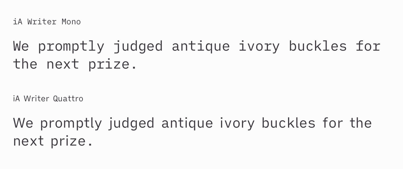
iA Writer
The first are a set of fonts used in iA Writer.
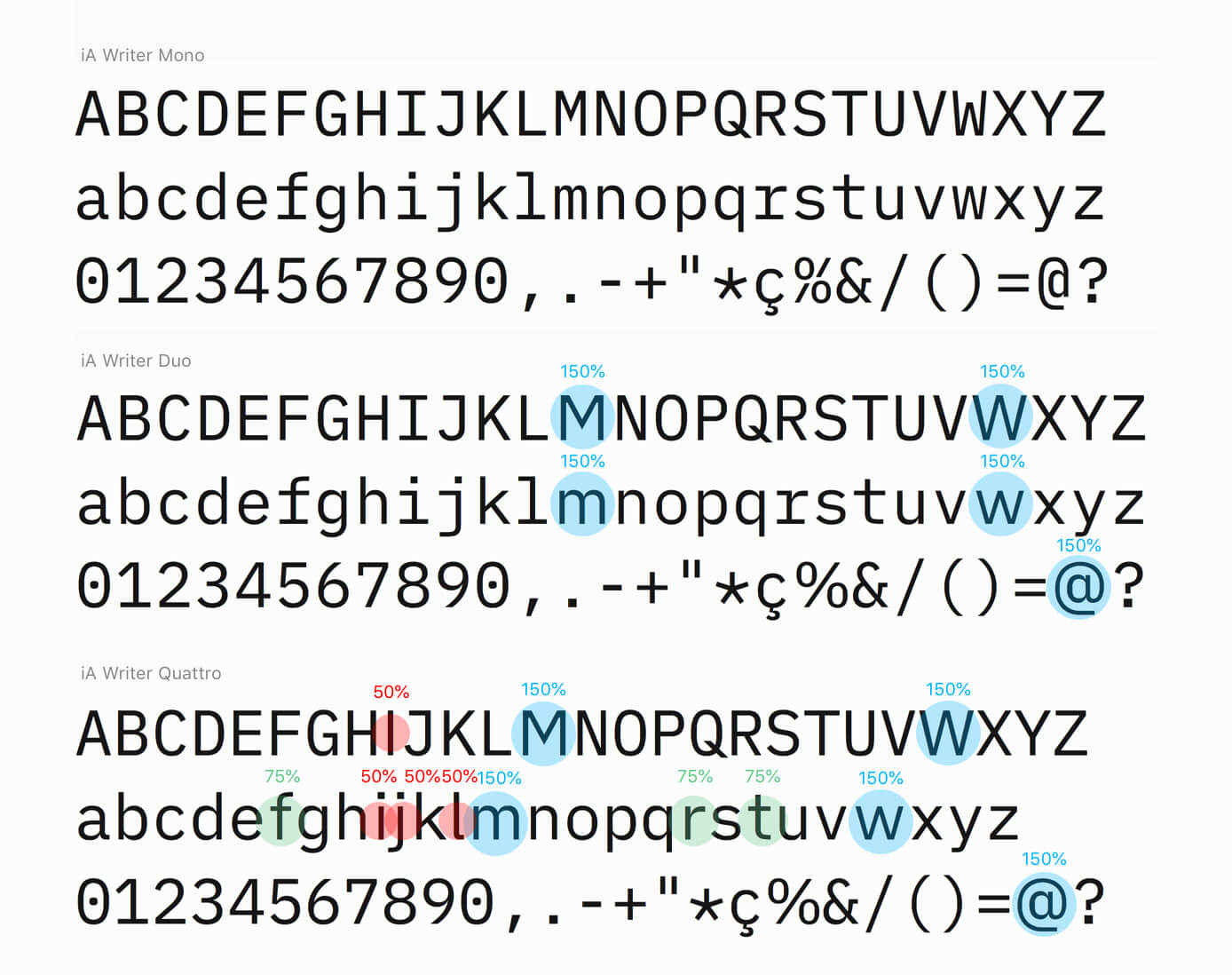
The first sample up top is monospaced. The second sample, iA Writer Duo, is interesting because all the characters are the same width except a few of the larger characters that need more space—they are set at one and a half width. That means any given character will be one of two possible widths, thus the name Duo.
The third sample above takes this idea even further. Yes, some characters like uppercase W need more space. But some characters, like lowercase i, need less. As the name Quattro suggests, every character can be one of four possible widths—half, three-fourths, one, or one and a half.
You might be thinking, “Okay, but now characters won’t line up neatly.” Thats true, but the upside of this sizing means you still retain the typewriter aesthetic with a bit more legibility. Notice the difference?
Input
The Input font family by DJR & Font Bureau is another great example of monospaced meets proportional. This one may be of interest to programmers as the slogan of Input is fonts for code. Similar to the iA Writer fonts, Input comes with monospaced and proportional versions.
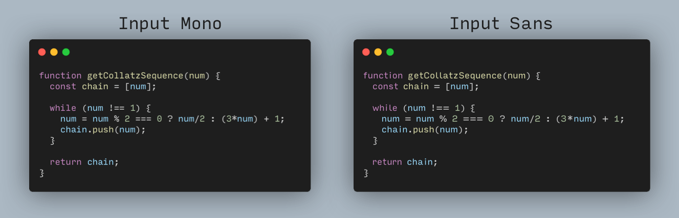
The difference is subtle but notice that the sample on the right gives letters like lowercase “m” a little leg room, improving the readability of the code. Even though Input Sans is technically a proportional font, it still gives plenty of attention to numbers and symbols, ensuring that they stand out and are easily distinguishable from each other.
This family has Mono, Sans, and Serif variations that come in multiple weights, as well as narrow and compressed variations.
Triplicate Poly
Edit 2023/07/16: I’m updating this article to include Triplicate Poly, a font that I originally omitted only because I forgot about it.
Triplicate is monospaced font from Matthew Butterick that inherits its style from typewriter faces of yore. It has a number of notable features—true itallics, three weights, small caps, and more. Relevant to us is its gorgeous poly version that retains the classic typewriter feel but offers nicers spacing and pleasing proportions on the usual troublesome supects.
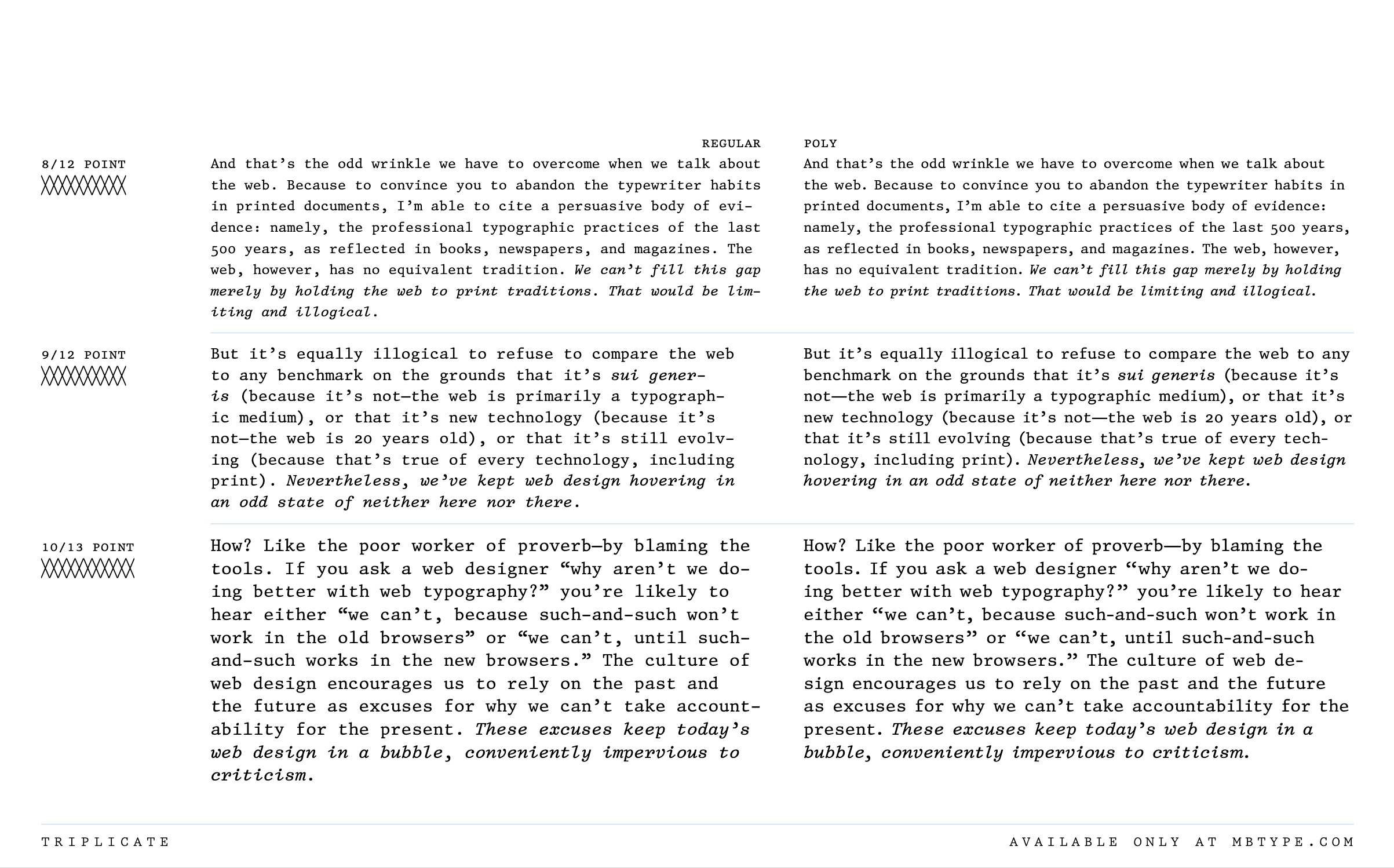
Triplacate Poly makes for a fantastic writing font, especially if you want that old typewriter feel. And its multiple weights and other features make it nice and flexible—and pretty comfy for reading too.
Triplicate (all styles, poly and mono, included) costs $119 at the time of this writing, but it’s worth mentioning that you can get the entire MB Type library of eight families (and a generous license) for $499, which probably makes it the best professional font starter pack available.
Why and how to use almost monospaced fonts
I enjoy using them for both writing and coding. I’m already obsessed with the style of monospaced fonts and these in-betweeners take the style to the next level for me. You get the readability of a proportional font with the rough draft feel of a monospaced one. When coding, you get easily distinguishable characters and just the right amount of space for characters that need more or less.
You can use these fonts in writing or coding apps or wherever you like. iA Writer fonts are open source. Note that Input is free for personal and unpublished usage only—if you want to use it on a website or in a publication, you’ll need to purchase the appropriate license.
- Get the iA Writer fonts from GitHub.[2]
- Get Input from its website.
If you want some more background on these fonts, here is some recommended reading:
- iA Writer: Writing Fonts: A Typographic Christmas
- Input: See what makes Input a different coding typeface
Never attempt to line up text by using spaces. The only exception is if you are using a monospaced font. But in word processing applications, there are appropriate tools available for lining up text, like tables and tab stops. ↩︎
There is an unfortunate metadata problem with iA Writer Quattro. If, when you are using it, you run into situations where bold and/or itallic isn’t working properly, see this page for more and to get repaired files. /ia-writer-quattro/ ↩︎