My home-cooked app for online bookmarks

Two years ago this month, I decided to make my own little app for keeping bookmarks. I’m a longtime customer of Pinboard, but I was becoming frustrated with errors in its archival functionally and, in general, it felt cumbersome to browse the way I wanted to. I decided I wanted to make something myself to fill this role.
I didn’t originally plan to release the code to the public. It’s a home-cooked app and I knew it was going to be a bit rough around the edges. But as I finished it, I figured it was good enough to offer the code as-is on GitHub.
I’ve been using it ever since and over the last month or so, I’ve made some significant improvements. I think it is finally time for me to write about it.
If you don’t care to read anymore about it but want to check it out, head over to the blakewatson/bookmarks GitHub page and check out the readme. It has instructions for setting up the app.
I cover the design and intention of the app in the readme, so some of this article will come straight from that.
Features at a glance
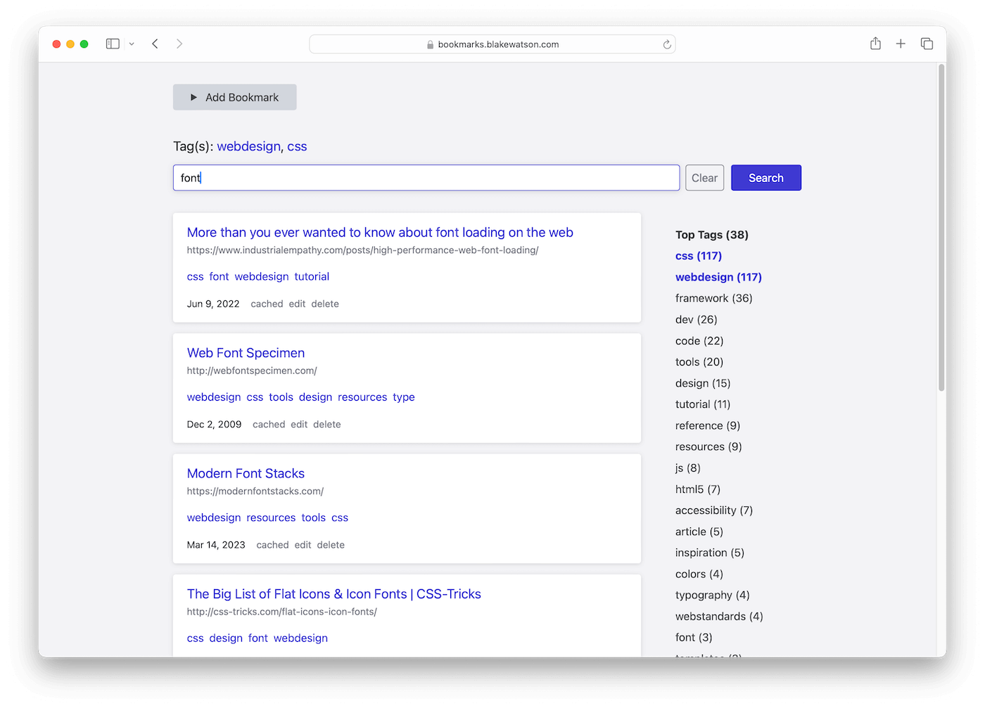
- Saves bookmarks — title, URL, description, and tags.
- You can filter your bookmarks by one or more tags.
- Has archival capabilities. Every bookmark is sent over to the Wayback Machine.
- Has basic search capability. Search within tags.
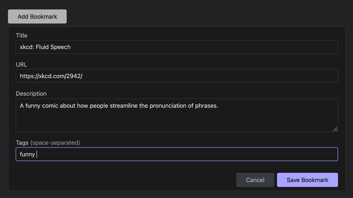
- Comes with a bookmarklet for quickly adding bookmarks.
- Also comes with an importer script that can convert a Pinboard export file into the format needed by Bookmarks.
Based on Pinboard but with some big differences
My app is somewhat modeled on Pinboard because despite wanting something of my own, I still think Pinboard is a good app. There are some pretty big differences, though.
I don’t really care about sharing my bookmarks so that social aspect is totally missing from my app. I could see myself possibly adding a way to make public listings of bookmarks at some point, though.
My app is not as robust as Pinboard. Pinboard is battle-tested and used by many. My app works for me, but is missing some of the affordances that Pinboard offers for the real pack rats out there.
For example, it just occurred to me that I don’t know what will happen if you try to add a tag with a really long name. I assume it will break the UI. Rip.
If I remember correctly, Pinboard does some cool stuff with tag groups or parent tags or something. There is none of that here. It is a simplistic tag implementation.
I have a few thousand bookmarks and the app runs fine on my admittedly high end machines. Pinboard is much more efficient at handling huge numbers of bookmarks whereas I do some inefficient things in the name of a fast frontend experience. This is something I could see myself improving over time as I accumulate more bookmarks.
How to use it
This is a NodeJS project so you will need to have a Node server. Other than that, there isn’t a lot of complicated architecture going on. It’s mostly just shuttling JSON back and forth between the server and the browser.
I have setup instructions over on the GitHub page. I recently (yesterday) added an init script that you can run to make setup as easy as possible. If you don’t care about archiving bookmarks to the Wayback Machine, you don’t need to do any configuration beyond running init.
The readme should cover it, so I won’t go into any further detail here. If you do happen to follow my instructions to set up the app, let me know if they were helpful and or how I can improve them.
Adding bookmarks quickly
Being able to quickly add bookmarks is a must-have feature. Otherwise I would never use it and this whole endeavor would be pointless. With Pinboard, there were multiple bookmarklet and browser extension options and I knew I needed something to replace those.
I decided to go with a bookmarklet. It passes info to the app via the query string. That pre-populates the create form.

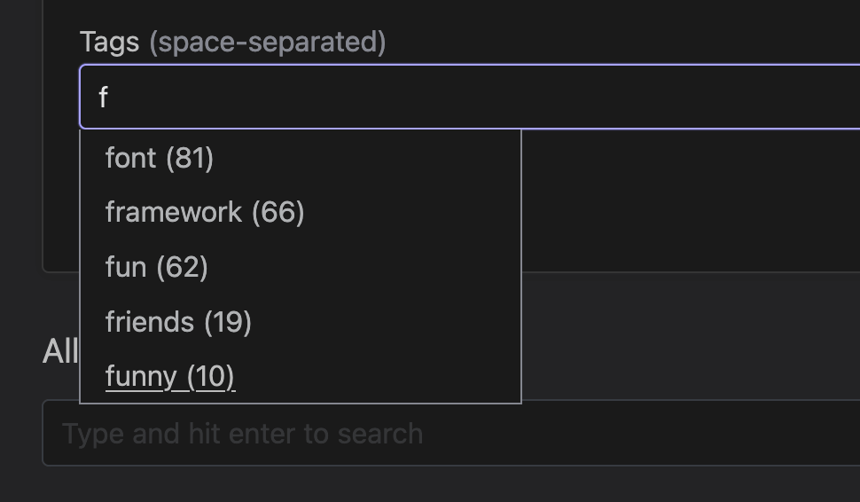
The tags field will offer autocomplete suggestions that you can select using the mouse or keyboard.

Development notes
There are probably a million different ways you could go about making something like this. As a person who enjoys the frontend more than the backend, my apps tend to have pretty simple backend architectures that are primarily trying to make data persistence as easy as possible. That’s the same for this one, with a little bit of added complexity in order to implement bookmark archival on Wayback Machine.
Backend
I usually go with PHP because I have a bit more experience with it than other backend languages. But for whatever reason I chose NodeJS and Express for this one. I can’t even remember why at this point. I’m sure there was a reason. Probably.
Mostly it’s a matter of saving everything to JSON. I didn’t really feel like passing searches to the backend, so I just pass the entire JSON data store to the frontend and perform searches on it there. I cache everything in localStorage so that startup of the app is quick. There is a point at which this method is going to fail and I’m going to have to move some stuff to the backend. But until then, weeeeeeeeee.
Frontend
I’m using Vue for rendering the frontend app. But, notably, I didn’t want to have anything to do with a build step. So I’m just grabbing Vue (the ESM one) and using it directly via template strings. Thanks to browser support for modules, I can split every Vue component into its own file. And because there are ways to get VS Code to highlight HTML inside template strings, it’s kind of like I have single-file components! Kind of.
This was my first real use of the composition API. It was… fine?. I’m so used to the options API, that I still organized my code that way, so I’m not sure I got the full benefit. It was still kind of neat, though.
I experimented with using JSDoc on this project to give myself better editor support—the kind I’m used to with TypeScript projects. I couldn’t use TS here because I was adamant about not having a build step. But JSDoc worked out pretty great. That probably deserves its own article.
Over this past weekend, I updated the styling of the site. I switched over from using Pure CSS to Chota. It’s a tiny framework that has just enough of the useful things you need.[1]
Accessibility
I still have some work to do here. When I was first building this, I didn’t even think I was going to release the code. It was just going to be my home-cooked app. As such, I fell into some lazy practices (such as using links as buttons in situations where I just wanted text without padding and such).
I did make some improvements during this redesign, but I still have a good bit of work to do in this area. If you happen to use the app and run into a problem, please create an issue and I will take a look.[2]
Things I know about are the links-as-buttons issue I mentioned, but also things like the tag autocomplete—how it works (it or most probably doesn’t) with screen readers.
Still home-cooked at heart
I decided to write about my bookmarks app and share the code. And even though I have made some recent efforts to make it better for everyone, it is still a home-cooked app at its core. And it is still designed with primarily me in mind. That means if there is a feature you want, while you are free to create an issue, I most likely won’t be incorporating it. Depending on what it is, I might be open to PRs. But really, this app will continue to grow in whatever direction my whims decide.
That said, I would be really happy to know if someone else gets any use out of it. So if you do decide to use it, let me know!
I’m always on the market for easy CSS frameworks. I especially like the classless ones and, when I need to actually make a design, I like the simple ones that I can wrap my mind around and start using quickly without a build step. If you know of any, hit me up. ↩︎
I realize that telling someone to create an issue if they have a problem is not a healthy long-term solution to accessibility. I just point it out because if something is actively blocking someone from using the app, I’d rather fix that problem before I tackle theoretical ones. ↩︎
