New personal mark
I’ve owned this little space on the web for a decade. The designs changed radically from version to version. Whatever branding was present changed with it—usually with little thought for the considerations you should make when creating an identifying mark.
My personal mark improved as I became a better designer and turned my energy toward freelancing. Still, it never felt completely right. The appearance was pleasing, the color palette attractive, but they all missed the mark (heh). They lacked something. Something I couldn’t pinpoint. Much like tasting a sauce and knowing that something is missing, my personal mark lacked that special, illusive attribute. Let’s call it the X-factor.
Fortunately, that’s no longer the case.
I’m happy to unveil this new mark, courtesy of esteemed designer and Genius Shawn Palmer.
After reading my own design brief for this mark I thought to myself, “if I know so much about I want, then why don’t I design it myself?” Anyone who has ever tried to design branding for themselves, personally, knows that it is a special kind of difficult. Further, a list of characteristics does not a great design make. The X-factor is hard to come by.
I love this mark because though it appears simple and obvious on its surface—as great designs often do—it has subtle details that make it interesting.
Bravo whiskey
From the brief:
I’d like a mark—without my name joining it—that either A) plays on the letter “W”, B) plays on the initials "BW”…
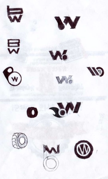
Many logo marks consist of initials that are visually joined in some way. In my own designs for my logo, I avoided using my two initials for fear that I would not be able to combine them in an appealing way. Having seen some of Shawn’s lettering work, I knew making sublimely intertwined initials was in his wheelhouse. Early sketches show the “w” with the “b” added onto the end.

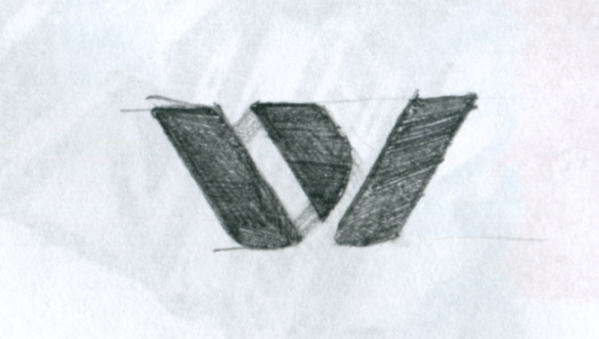
While aesthetically pleasing, Shawn felt it was important to get the order right. You can see from a later sketch how the “b” gets tilted then folds out into a “w”.

Reinvent the wheel
From the brief:
…or C) something that makes a subtle reference to my wheelchair while staying far away from anything resembling the handicap parking symbol
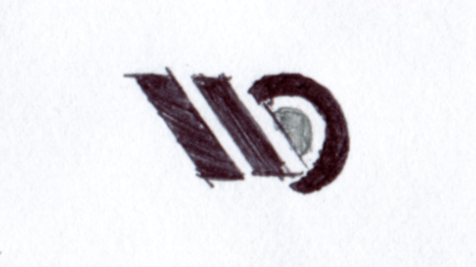
My previous logo marks drew inspiration from my wheelchair, specifically the concept of a wheel:

I wanted to maintain this link in the subtlest of ways.
The new mark delivers. It’s not something that everyone will notice—and that’s the beauty of it. Admittedly, I could be reading into it, but for me the new mark captures the wheel in two ways:
- The obvious is the circle in the enclosed version.
- The “w” itself resembles the tread of my wheelchair’s tires.
Even if I am just projecting my own meaning onto the ink blot here, it’s true that the concept of the wheel played an important role in the thinking behind the mark—it’s a motif found throughout the sketching.

Lines, angles, and arcs! Oh my!
From the brief:
- Works at small sizes
- Modern and or geometric (no grungy strokes)
- Finesse instead of power
- Cool minimal
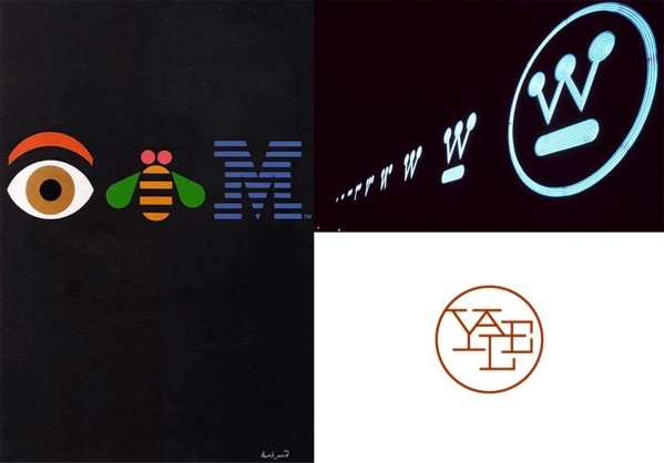
I love the geometric characteristics found in the works of twentieth-century modernist designers. So much so that I asked Shawn to channel his “inner Paul Rand.”

You won’t find any irregular shapes or muddy textures here. The new mark is informed by the math that constructs it.[1] The enclosed version balances an elegant contrast of sharp lines and angles to the smooth curve of the circle. It brings to mind the old wax seals of yore, an apt analog metaphor.
The new mark’s geometrics are precise, but not machined to perfection. The hand of the artist is at work in the subtle details like the cuts in the contour of the “b”.
Depth perception
From the brief:
- Single color
This is the one area where I would say that Shawn went rogue—and it paid off. Perhaps my favorite characteristic of the new mark is the ability to flip a switch (change a few fill colors) and watch this wonderfully minimal silhouette move into the third dimension.
The color of the shapes that connect the first diagonal stroke of the “w” to the middle diagonal stroke can be changed to create an illusion of depth. Not only that, but it provides an opportunity to play with color. I can see this being a cool effect at larger sizes.
The complexity of simplicity
Great design that appears simple and obvious rarely is. Behind the scenes, it takes thinking about and distilling complex ideas into a core meaning.
“Simple ideas, as well as simple designs are, ironically, the products of circuitous mental purposes. Simplicity is difficult to achieve, yet worth the effort.” – Paul Rand
My thanks to Shawn for hooking me up with this sweet logo. I’m thrilled to finally have a mark I’m proud of and I hope you, my dear reader, enjoy it as much as I do.
The logo implemented on this website is an SVG, so it’s rendered by your web browser according to mathematical instructions. It is literally built with math! ↩︎
