MagnoliaJS 2023: The joys of home-cooked apps
Links and stuff
Here’s quick list of links to the stuff I mention in the talk. Scroll down for the full text. This page is also accessible at .
- PDF slides
- An app can be a home-cooked meal by Robin Sloan
- Start (no longer maintained)
- A Fine Start - my side hustle
- My DIY bookmarks app
- Writer Emergency Pack
- National Novel Writing Month
- Finishing side projects
Home-cooked app submissions:
- Scout’s dashboard
- tobuy GitHub repo
- Spencer’s siri shortcut tweet
- Breastfeeding tracker
- Celebrate
- Burninator
Text version of the talk
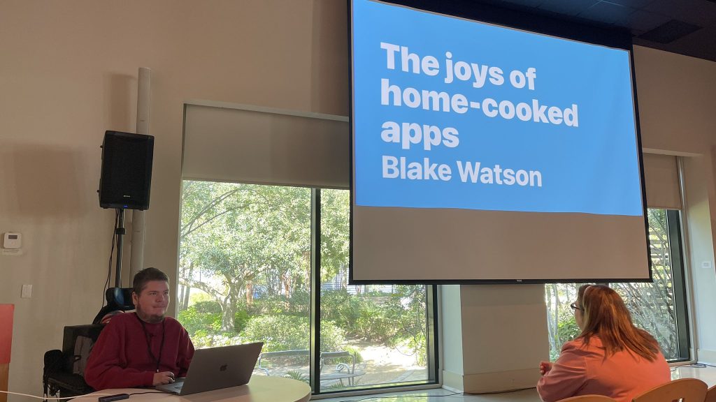
Hey everyone. Welcome to The joys of home-cooked apps. I’m Blake Watson. I’m a frontend developer and side-project enthusiast. I have a disability called spinal muscular atrophy. It basically means my muscle tone is in the trash. I will never be a gymnast. But I could plausibly turn out to be a supervillain.
I use a lot of technology to adapt and thrive, including some home-cooked apps I’m going to talk about in a bit. The state of technology, with all its faults, is pretty amazing right now. I basically get paid to sit in my house, click a mouse, and watch photons emanating out of a glass rectangle. What a time to be alive.
I work remotely with MRI Technologies out of Houston, TX, working on projects for NASA and Collins Aerospace. I primarily work on a suite of internal web applications called COSMIC, which NASA uses for tracking and managing hardware related to the spacesuit.
Before that I worked at Mad Genius, shoutout to the best ad agency in Mississippi. Before that I was a web dev enthusiast with no job for several years. So if you find yourself in that situation, don’t give up. Probably follow Taylor’s advice.
I’m excited to be back at MagnoliaJS. Although, apologies to the other speakers—I’m mostly here to watch Kenneth LaFrance.
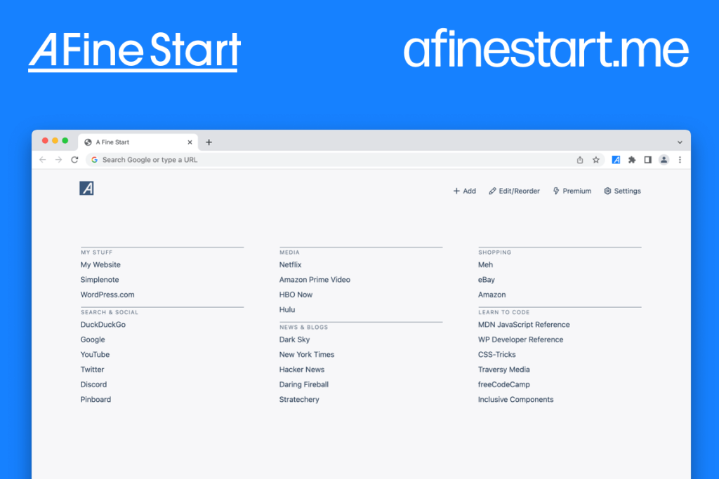
I’m also a community sponsor of MagnoliaJS again this year. A Fine Start is my main side-project. It’s a new-tab page browser extension. And I’ll be talking more about that in a bit.
I have difficulty traveling but I had a lot of FOMO seeing all these great tech conferences around the country that I couldn’t get to. Frustrated with my options, I wrote a post on my blog in 2010 titled “Mississippi needs a Web conference.” So this is personal for me and I’m very happy to support MagnoliaJS. Also go download my browser extension.
Home-cooked apps
So what am I talking about? What is a home-cooked app? It’s the kind of app that you make for yourself, to solve your own problem or for your own entertainment. Much like a home-cooked meal, it can be shared with friends or family. But it’s not designed for mass consumption.
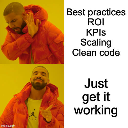
Home-cooked apps aren’t optimized for shareholders. There are no sales funnels. No user stories. No scrums. And they don’t scale. They don’t have to. They aren’t designed for thousands or millions of users. These are the kinds of apps that you make for a handful of people. Or maybe just for you.
Robin Sloan — author & home cook

Now I didn’t invent the term, home-cooked app. A couple of years ago I read an article by Robin Sloan. He’s a New York Times best-selling author and calls himself the “programming equivalent of a home cook.” In this article he described making this sort of short form video messaging service just for use in his household.
It was super simple. You basically hit record, send the video, and the receiver views it, after which it disappears.
That’s it. He built it because the proprietary app they had been using was discontinued.
The important bit here is that he didn’t make this app to be a product for the general public. He didn’t even design it to be a shared open source project. It’s literally an app built just for their own use. And that’s what makes it home-cooked.
I’ve been making these kinds of apps for myself for years. It’s one of the things that drew me into programming. But I didn’t have a term for apps like this or even a context for thinking about them until I read Sloan’s article. I was thrilled to have a word for this idea—the idea that you can make useful things and they don’t need to be packaged for mass adoption to be successful.
Making a home-cooked app is about redefining what success looks like
I love this. It’s a powerful idea. And maybe developers do this all the time—build things for themselves. But Sloan’s article was the first time I had heard it expressed this way and it smacked me right in the face—like of course we can make stuff just for ourselves. This is a thing we can do.
Now, that’s not to say you should never generalize a solution to make it more useful for more people. If you’re working on website or app meant to be used by others, you should be as inclusive as possible. I’m just saying not every idea needs to be a product or a package to be distributed.
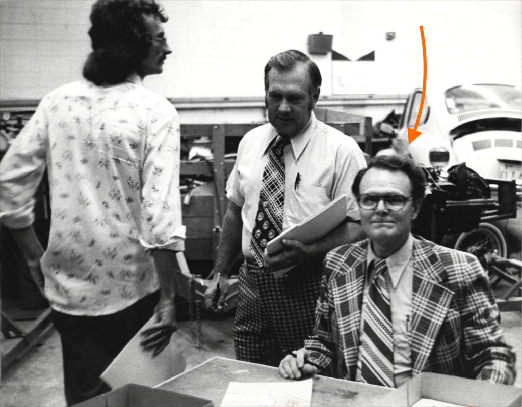
I think back to my late grandfather who would often take to his shop to make custom things for himself and his family—a cabinet for his wife, toys for the grandkids, and even a custom-made wheelchair lock down system designed specifically for the van and wheelchairs me and my brother had at the time. As a kid I was mesmerized with his craftsmanship. Watching him, the idea of building things for oneself was ingrained in me at a young age.
Okay, enough backstory. Let’s get into it.
Why? How? What?
My job here today is to:
- Convince you that you should make your own home-cooked apps
- Show you a bunch examples of home-cooked apps
- Give you a little recipe to help you get started
But why tho?
There are several good reasons you should make your own home-cooked apps.
-
You can make exactly what you want. Have you ever used an app and thought to yourself, “Man, this app would be dope if it just did this one thing?” Guess I’ll have to make a feature request and wait around for months until the developer says they’re not going to do it. No, guess what? When you make it yourself, you can make it do that thing.
-
If you build with the idea that you are only serving yourself or a few people, you can skip over many of the challenging problems of software development: compatibility, extensibility, standards, best practices, scaling, etc. In the land of home-cooked apps, the only important benchmark is, does it work for you.
-
Another reason is privacy. You have some control over your data, depending on how you build your app. You have an opportunity to keep it out of the hands of big companies who will harvest it and use it for its own purposes.
-
Lastly, it’s fun. Building what you want and then using it is a rewarding experience. It’s magic to me. It’s what pulled me into web dev and why I still get excited about it.
And with that let’s take a look at some examples. They’re gonna start off more general and get increasingly weirdly specific.
Start (This became an actual product. Oops.)
Okay I’m going to start (heh) the tour of examples by breaking one of my own rules. I made this new tab page called Start for myself but ended up packaging it up for other people to use. It ultimately became my main side project, A Fine Start.
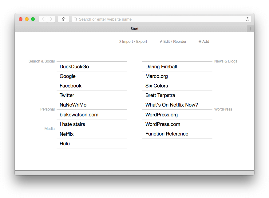
The idea here was to have a single HTML file as a new tab page that would allow you to add and organize text links directly on the page. At the time I created it, built-in new tab pages were using gratuitous visual effects, ugly screenshots of webpages, and had very poor user experience in my opinion. I just wanted a new tab page with plain text links that I could add, edit, and arrange.
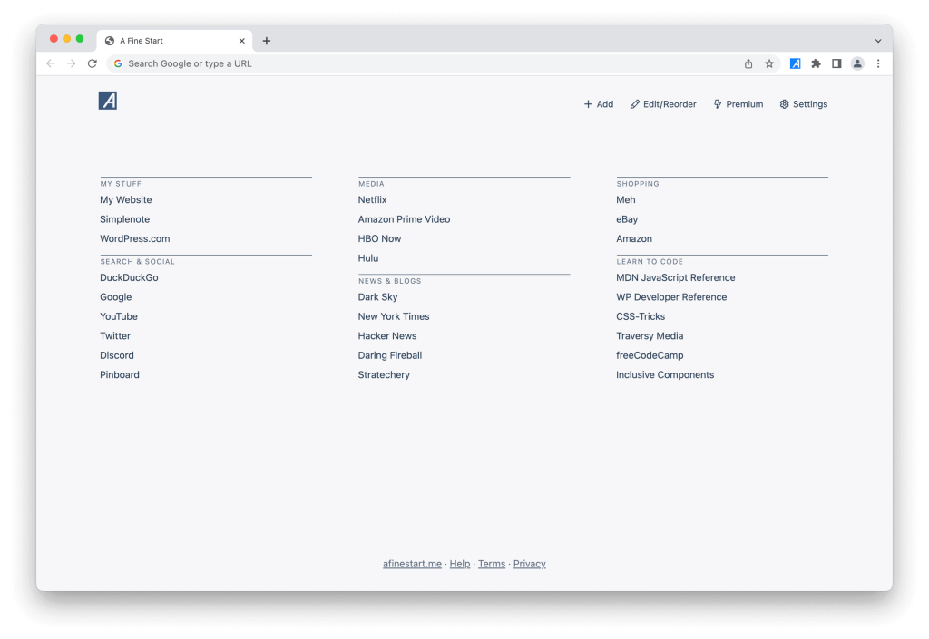
I made it for me but after a few years I ended up packaging it up into a browser extension called A Fine Start and found out others liked it too. That’s cool that it worked out that way, but it’s not required in the world of home-cooked apps.
My DIY Pinboard replacement
If you’ve never heard of Pinboard, it’s a web app for keeping web bookmarks. So it keeps the URL, title, description, and you can add tags for organization. I’ve been a longtime user and this app met my needs adequately for a long time.
But it was also becoming the place where my bookmarks went to die. I felt like retrieving things from it wasn’t very easy. I also paid for an optional archival account. This means that every link I add gets cached by Pinboard so that if that URL goes bad (which so many of them do) I would still have a copy.
But I noticed my archival account was often failing to capture pages. And the whole thing was becoming unenjoyable.
What to do?
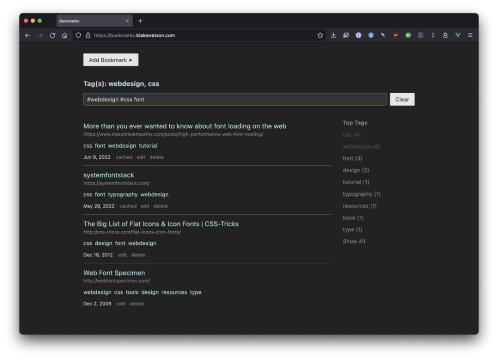
You will be shocked to hear that I created my own solution. It’s a NodeJS app that saves URLs along with metadata like descriptions and tags. It automatically sends the URL to Wayback Machine via an API and it saves the cached URL that Wayback returns, so that I always have access to a cached copy.
Now just to be clear, this is an app I host myself for just me. It doesn’t have users or sign ups or anything like that. I did break my own rule and open sourced this app with instructions for setting it up. But it comes with the huge caveat that I designed this for me and didn’t take any other people into account.
PayMeNow
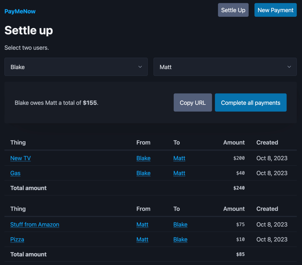
My family is constantly getting mixed up about what money we owe each other.
So a couple of weeks ago I made this little app called PayMeNow to help my family keep track of what we owe each other. In this screenshot we’re looking at what I called the settle up screen. You select two people (me and my brother in this case) and you get a list of everything owed between us, which gets boiled down to one number.
We’ll use Cash App or something separately to make the actual payment then we can hit the Complete all payments button to mark all the items as completed
Writer Emergency Pack card viewer
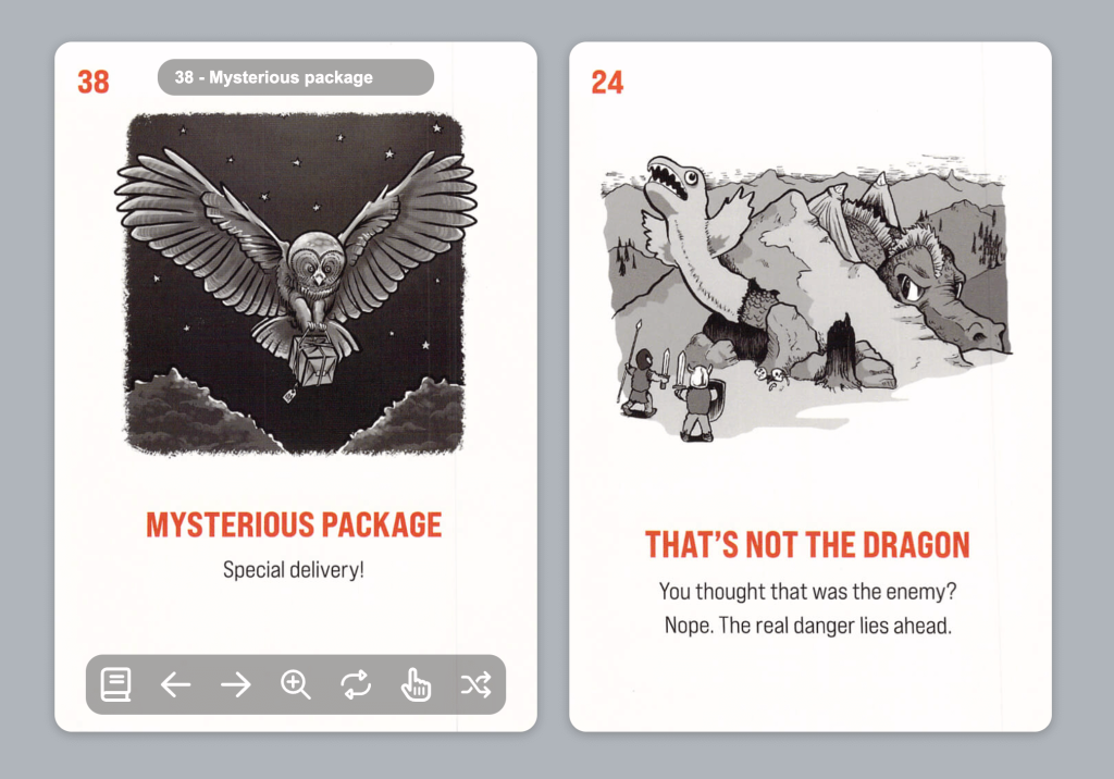
So I enjoy doing a bit of creative writing. Every year I participate in a marathon event called National Novel Writing Month. (Just curious show of hands if you have ever attempted it)
It’s a wild 30-day challenge to write a 50-thousand word novel during November. It often means I’m scrambling to invent my story on the fly.
So I ordered this deck of cards called Writer Emergency Pack. It’s a thing for storytelling. Every card has advice on how to get your story unstuck, giving you new ways to think about your characters and plot. They’re awesome, but I’m not able to physically handle a deck of cards, so I had my assistant help me scan them all in and I created a web viewer that lets me flip through the cards, draw them at random, flip them over to read the back, and generally use them as you might the physical deck.
There’s a link in my notes to their website but I’m not allowed to share the web viewer because of copyright.
A home-cooked language
My brother and I have a team of caregivers that work various day and night shifts. At the end of each pay period they need to turn in detailed timesheets. Sometimes these timesheets are difficult and error-prone.
I wanted a way to keep my own records and also help my caregivers complete the timesheets accurately. I toyed around briefly with a spreadsheet. I know they’re powerful, but man I hate them. After being annoyed with that, I decided that what I really needed was something that worked like Markdown. I wanted a plaintext entry system. It works like this:
1# This is a comment. It is ignored. 2 31 Day 4Johnny Appleseed 5 61-2 Night 7Jane Doe 8 9# Johnny left early102 Day (7:00am-3:00pm)11Johnny Appleseed12132-3 Night *14Jane DoeFor each shift that is worked, I make an entry. Entries are separated by a line break. Each entry is two lines. The top line is the date followed by the type of shift that was worked (Day/Night). The next line is the name of the person who worked.
Most shifts follow a standard time range so I don’t specify the start and end time. But if, for some reason, someone works a different time schedule than normal, I can specify that in parentheses.
That last piece of metadata is represented by an asterisk and it means my bother and I were together for the whole shift and the caregiver worked with both of us. That means they’ll need to do a timesheet for each of us and split the hours.
I don’t specify the month and the year because that info will be used at compile time, which we’ll see in a second.
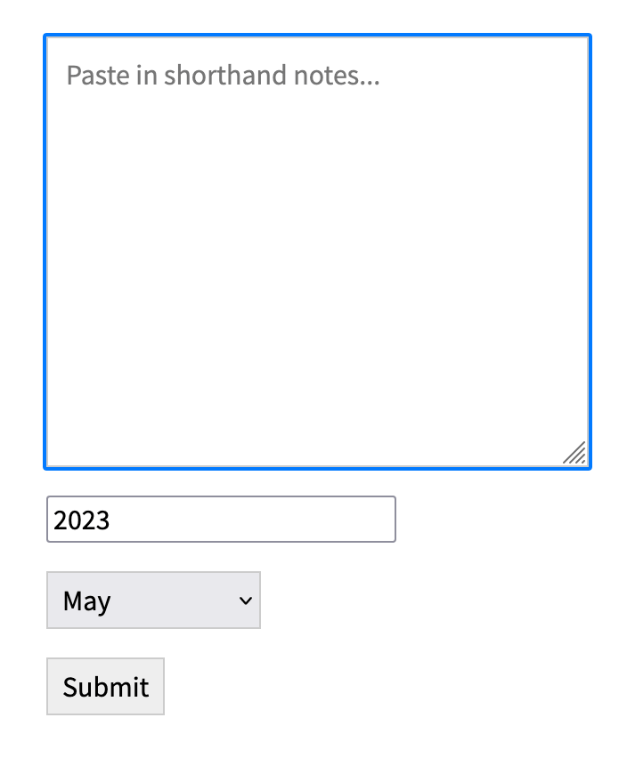
I wrote a little frontend tool that can process this syntax and spit out a table of dates and times that I can print out for my caregivers to help them complete their timesheets.
This is where I paste in the plaintext data and provide the month and year.
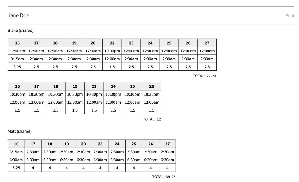
This is an example printout. It’s hard to tell what’s going on here—and that’s why I made this tool to figure it out. The timesheets we have to use were terribly designed.
The agency requires that the timesheets be completed by hand so what my tool does is output something that my caregivers can use as a reference while they are filling out the timesheets.
Domain-specific language
I didn’t know it at the time, but this kind of thing has a name—it’s called a domain-specific language. In this case, a human-readable computer language designed specifically for tracking caregiver hours between two people. My frontend tool is the compiler so to speak, which produces the final output—HTML tables I can print. I store all of my records in my note-taking app of choice as what you could think of as source code.
This year marks one decade since I first made this app. I’m sure I would do it much differently now, but even with its idiosyncrasies (and a lot of jQuery), it gets the job done and it’s held up longer than many other things I’ve made.
Crowd-sourced examples
I put out a form and took submissions from people on social media, specifically asking for examples of home-cooked apps. I got some great examples back.
Scout
This is Scout’s dashboard. Scout is a dog who has epilepsy so her owner, Gaston, made this page that keeps track of her seizures and he shares it with friends and family who want to know how she’s doing.
It has some nice charts and graphs with things like:
- Scout’s seizures broken down by time of day, day of the week, and even phase of the moon.
- It categorizes her seizures into three types so all the breakdowns are further split into those.
- And it has descriptions of what her symptoms and behavior are like.
It’s just a sweet personal thing that’s incredibly useful to the people who need it.
I love living
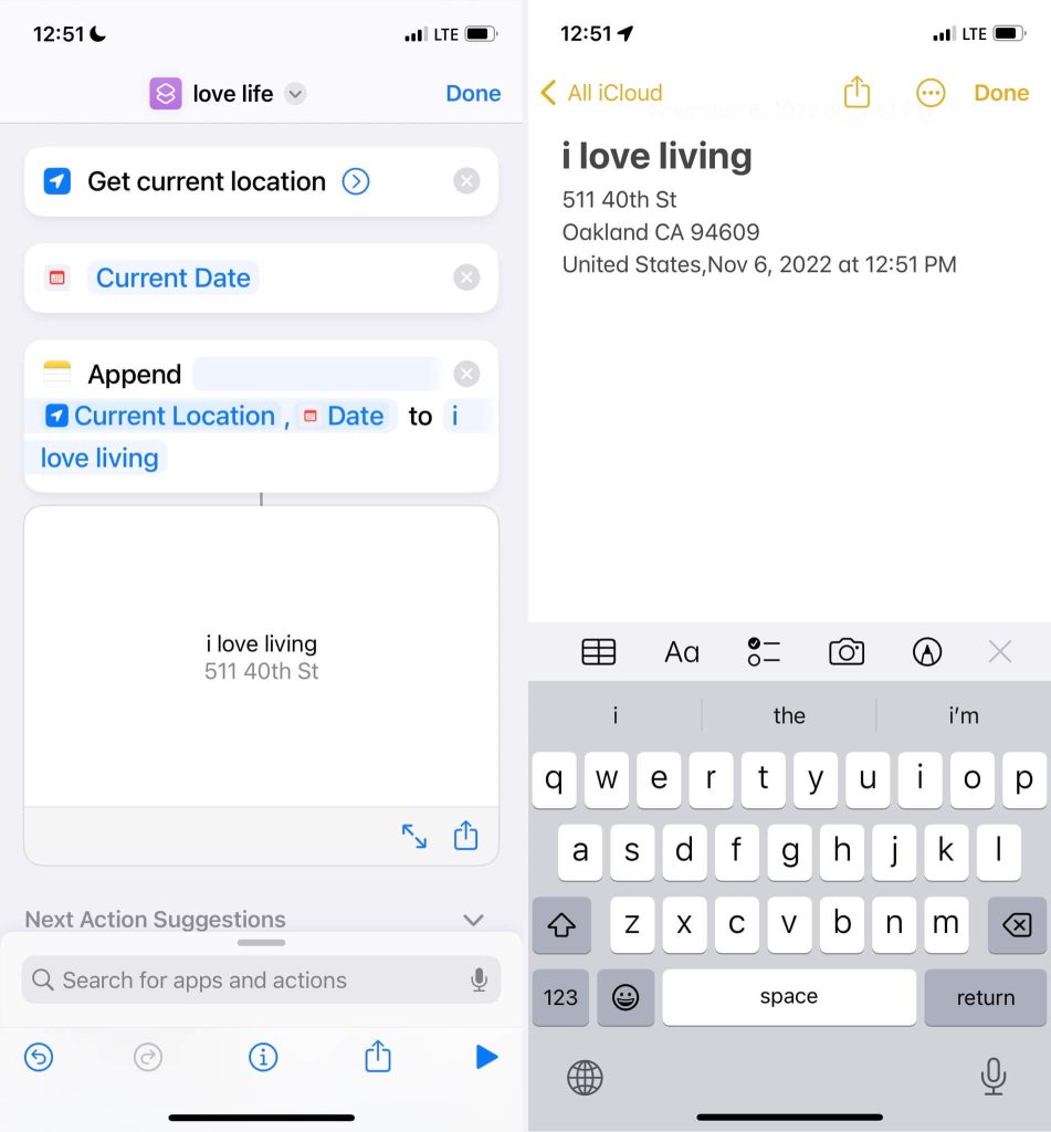
Spencer said “[I] have started keeping a note in my phone where I had a timestamp every time I am intimate with the feeling of an indomitable joy of / gratitude for life. It’s a Siri shortcut now.”
What I love about this is that it’s an app made with the no-code tools that were available. You might not think of it as an app at first, but tools like this can enable even more people to create software specific to them.
Other submissions
David made a breast feeding tracker for his partner that only asks which side and when you hit the button it records the time in localStorage until the next time. That’s it. A two-button app.
Felix struggled with being lonely after starting his degree so he made an app where you list out your achievements and, after a short loading sequence, it gives you a compliment.
Simon submitted a grocery list app he created for him and his wife. I love this because he said “No” to the million-and-one list apps out there and made his own. Now there’s a million-and-two.
Reilly’s friend had a laptop where the screen would flicker if the GPU dropped below a certain temperature so they made an app that keeps the GPU warm—literal cooking in this case.
Recipe
These apps were made for me or their respective creators, so I’m not expecting you to think, “Oh I could use that,” necessarily. I just want to get your creative juices flowing about how you could address some of your own specific wants and needs.
The What
This is just a little recipe to get you started. There is really no right or wrong way to go about it. If it works for you, then do it.
Think of a problem of yours that you could solve. For example, some tedious work that you wish you had an app for but don’t. Or something you and your friends would like to use that isn’t readily available. It could be something a popular app does but in a way that is much simpler and straightforward or specific to you.
The What, exactly
Once you have a general idea, give yourself some rough requirements. Make a list. If it has UI, do little napkin sketch. I like to go into my notes app of choice and type out a list of the features I need and jot down a few notes about the behavior of the app.
It’s important at this stage to explore ideas but don’t be tempted to add a million features. You don’t want to get overwhelmed and kill the project on the vine.
You may have heard the term, MVP, or minimum viable product. It’s the idea that you define the least amount of features that accomplish the main goal of the app. That’s close to what we’re doing here, but even easier! Because remember, we’re not making a product per se. It’s something simpler and rougher. It’s home-cooked. Let’s call it a minimum viable meal. That’s your job as a home cook to figure out at this stage.
The main thing is to solve your problem, not some abstract user’s problem. That may sound obvious, but it’s easier said than done. All of your developer instincts are gonna push back and throw little red flags up. Ignore them.
The How
Determine the easiest way to get to your goal. No need to over-complicate things—unless you enjoy that sort of thing! We are developers after all.
My advice here is to use what you know. But really you can use whatever technology you want. I don’t care if it’s new and shiny or old and boring. Use jQuery if you want. Or no JavaScript at all. This thing you’re building just needs to work for you so feel free to adopt whatever technical debt you want.
What’s important is that all decisions are in service of getting the thing to work.
Build it
Even if it’s a larger project, just make small progress toward it. I’ve written some tips about finishing side projects. Check out the written version of this talk for a link to that.
But TL;DR, small progress adds up. Use your commit history for motivation—it’s an automatic list of everything you have accomplished. If you’ve kept things simple, then hopefully it won’t take too long to knock out the rough draft.
Once you start using it you can take note of any enhancements or bug fixes you need to make.
Go cook up your own apps!
Most of the home-cooked apps I’ve made took me a weekend or two. When you strip an app down to its essentials and the only requirements are yours, you have the freedom to hack things together however you see fit.
I think the time investment on these projects was totally worth it. The example of the timesheet system, in particular, has saved me probably days of time pouring over timesheets.
Hopefully this has you thinking of how to tackle a problem of your own or make a fun thing just for friends or family. Home-cooked apps are fun, useful, and a breath of fresh air.
So, go forth cook up some of your own.
