My answer to the gratuitous new tab page
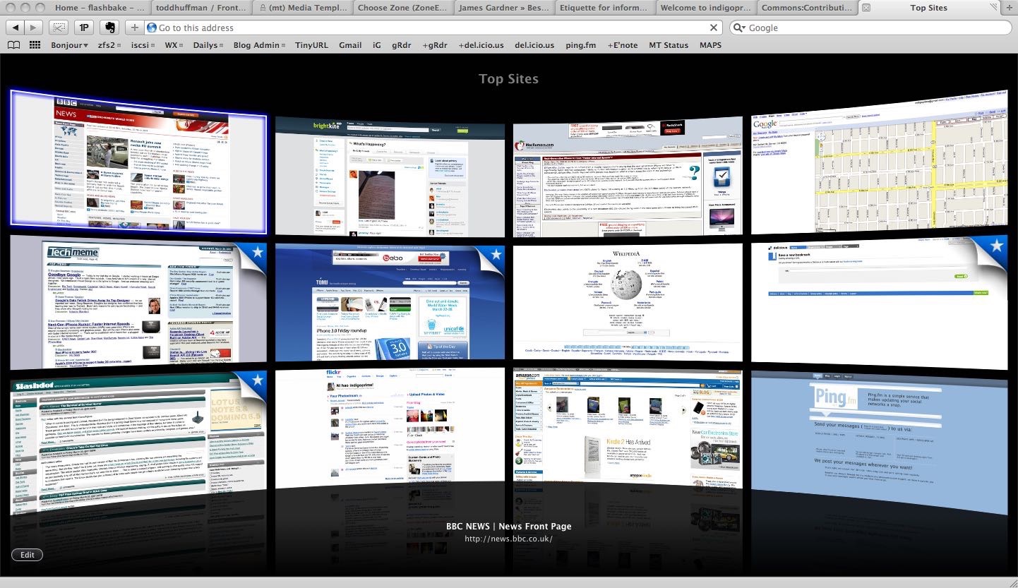
Several years ago, Safari shipped with a terrible, over-the-top new tab page that showed your recently visited sites as a giant TV grid. It even had the signature reflective floor. It looked like this:

The situation has improved somewhat since then. Current versions of Safari and Chrome still show a grid of recent site screenshots (though Safari has options to show something else[1]), but they embrace a softer, more elegant design.
Still, I find having a handful of website screenshots on a fresh tab to be incredibly inefficient and, frankly, ugly.[2]
So several years ago I created an HTML file with a pretty list of links and used that as my new tab page. When I tired of editing HTML just to add a link to the page, I made it into a single page application that saved the links to the browser’s local storage. That became Start, a downloadable file or hosted page that I offered for free. I used it happily for several years, but struggled to keep my links synced between browsers.
Introducing A Fine Start
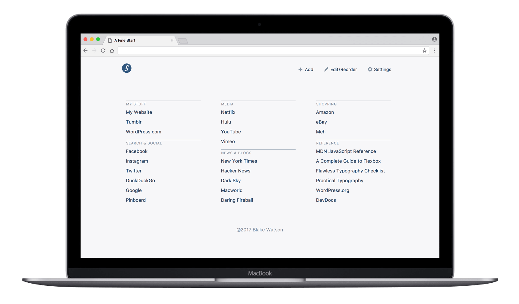
Fast forward to 2017. I began rewriting Start from scratch with the goal of adding user accounts for syncing links. I released A Fine Start to some testers in June and now it’s publicly available as a hosted web page or Chrome extension. The idea is simple—you open a new tab, you get a list of links, grouped and sorted to your liking.

A Fine Start is for getting in, then getting out. It doesn’t force your brain to parse tiny images of websites or stress over which sites to “pin” in place. Add whatever groups and links you want. They’re stored in local storage, and you can import/export them to share them between browsers and devices. No emails, accounts, or payments necessary.
For $5 a month, you can get a Premium account that will automatically keep your links synced.
The zen of the list
I’ve been using this system in one form or another for years now and whenever I’m using a web browser without it, I feel lost. I suspect the keyboard-oriented folks couldn’t care less about what shows up in a new tab—they’re going to immediately invoke the location bar’s search and suggest functionality. But for the click-happy (or OCD organizers) among us, seeing a neatly displayed list of links is supremely satisfying. No messy screenshots and no BS.
Designers, you may appreciate the minimal aesthetic with an obsession over typography. This is far from a plain old ugly list of links. I went through several iterations of list, link, heading styles to get the right look. The design embraces cool gray for negative space which is intended to make it feel more like a native tool than a web page.
Try it out
A Fine Start is absolutely free for the majority of its functionality. Give it a shot and let me know what you think. If you love it and want to use it everywhere, consider grabbing an account. I think you’ll enjoy it as much as I do.
Including a custom URL, which is how you may use A Fine Start in Safari. ↩︎
Have a list of news sites? Now you have notoriously bad web design plastered all over every new tab. ↩︎
