Links

Hardcore IndieWeb: Run your own website 100% independently for only $0.01/day

Adam Newbold of omg.lol, blogging at Neatnik:

The key aspects of Hardcore IndieWeb are control over your content and portability of your website:

  • If your content doesn’t primarily exist on your own hard drive, you don’t fully control your content.
  • If you don’t have a copy of your published HTML and web assets on your own hard drive, it’s not truly portable.

If this position sounds a bit hardcore, it is, but that’s the kind of person this guide was made for. It’s worth mentioning that the principles are hardcore, not the skills needed—in many ways, the instructions Adam lays out here are even easier than other methods of creating a website.

The process looks like this:

  • Author your web content on your hard drive.
  • Preview it in your web browser.
  • When you’re happy with what you have, upload it to your web host. Repeat as often as you’d like.

That’s it. It really is that simple.

The rest of this guide walks you through this process in more detail. It celebrates being close to the actual code of your website as opposed to layering on dozens of abstractions.

It’s a very similar ethos to HTML for People (and indeed, he links out to it several times), but with a focus on ensuring control of your data at every point in the process.

My own website follows most of these principles, except I am using a static site generator, at the time of this writing, and a somewhat complex templating system. But most of my website is previewable locally, lives in a repository, and gets deployed to my server at NearlyFreeSpeech.NET. I say “most of my website” because, at this point, my website has become its own organism with various sub-pages and things that aren’t tracked in the main project. The website as it lives on my server is the only complete representation of the website, but I do weekly backups just in case.

I also immediately thought of my brother’s website. His website is a simple blog that he made with vanilla, handwritten PHP, including the RSS feed!

I enjoyed this guide, and even though I think it’s totally fine to use a blog service if that’s what works for you, it’s always good to remember that layers of services and tooling aren’t actually needed to make a website. A website is just a collection of files. When I learned this fact over 20 years ago, it was eye-opening for me, and it’s what immediately drew me in to making websites.

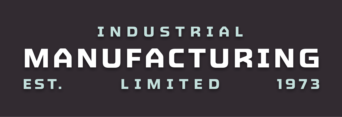
Juncture: an industrial font superfamily from Lettermatic

 blocky industrial font that says 'Industrial Manufacturing'. The word 'Manufacturing' is rendered in a chrome style.

This quirky uppercased font appeared on my radar by way of the SimpleBits® Secret Club™ Slack chat.

Really love the vintage feel of this font, but the real super power it has is its extreme flexibility. It comes in four distinct styles with multiple weights and widths. There are so many ways you can mix and mash this font up to get a specific desired effect.

But the reason I’m sharing it is because of the whimsical, interactive micro site. Just incredible.

Little websites everywhere

Michelle Barker’s post is relatable to a personal homepage enthusiast like myself.

Building a website feels old-fashioned these days. How many more websites do I have left in me before the old fire flickers and dies? Is snuffed out. Before making websites is no longer a viable way to earn a living? The web will change drastically within my lifetime, maybe someday soon, indeed it already has. Maybe it really will fizzle out, a graveyard haunted only by bots and crawlers. But I have a hunch that there will be a long tail. Amid the dying embers, a resilient cohort of indie web bloggers, artists and creators will keep going, keep on talking to each other through their blogs, without tracking, pop-ups or invasive ads. Making fun websites, helpful websites, pointless websites (the best kind) that serve no purpose other than to manifest someone’s spark of creativity.

It’s hard for me to imagine the fire ever snuffing out. My sites have never been hugely popular and I’ve never had a large audience except for blips and spikes here and there. But that’s not why I have a website. I make blakewatson.com for myself. I do it so I can copy a link and send it to a friend. I do it as a record of my thoughts and passions. I cherish the small amount of visitors I do have and the occasional email I receive about something I wrote. The long tail is real. There are real humans out there who just want to enjoy each other’s websites.

Mediocre ideas, showing up, and persistence

This is an oldie but a goodie from Chris Coyier, back in 2013.

Keep doing it until you’ve done everything you set out to do and everyone and their mom knows it. I didn’t stop blogging when barely anyone read it for years. I didn’t stop when people told me I was dumb or wrong. I didn’t stop when redesigns were met with vitriol. I didn’t stop when faced with mountainous challenges like inexplicable server failure, legal trouble, and theft of the site itself.

There really is something powerful in setting out to do something, doing it, and continuing to do it over a long period.

Overjoyed: an accessible virtual gaming controller

This Windows app provides a mouse-based virtual controller that can interface with a Nintendo Switch by way of a physical control from 8BitDo. So you need the 8BitDo Micro Bluetooth Gamepad. Then you install Overjoyed. Once you do the setup process, you can hover your mouse over the virtual D-pad to trigger the same directions on the Switch. There are a ton of additional features like allowing mouse click to trigger secondary actions and all sorts of other useful settings.

I’m on a Mac, but I was able to install Overjoyed in a Windows VM using UTM and it worked great.

Warm Burnout: a color scheme with warm colors and good contrast

Sometime within the last couple of years or so, I became totally burnt out (heh) on cool colors. I’ve started using color schemes and themes (in different apps that support them) that employ warm, earthy colors instead.

I recently found this one and one of the things I like about its theme for VS Code is that not only does the dark variant look good, but the light variant does as well, ensuring that all text meets WCAG AAA contrast standards.

It’s rare to find a good light theme with solid contrast. Even more so to find a good one paired with a good dark one as well. I haven’t been tempted to override any of the colors yet, which is saying something.

Meet Tuna: a brand new, modern, modal launcher for macOS

The excitement—and, frankly, sheer giddiness—with which this developer introduces his new app is the most wholesome thing I’ve seen this week.

From the minute when I started watching it, I was thinking that the last thing I needed was an app launcher, having had a Powerpack license for Alfred for… checks notes… nearly 14 years!

But the more I watched, the more I was intrigued. Before I could even get done with the video, I had the app and the Pro license.

Yes, I am aware I have a problem.

(Yes, I know Raycast can do everything. If you like it, cool.)

[Video] Do It With Style: Rethinking CSS

One of my goals this year is getting better at CSS. I joke that my CSS skills peaked in 2015. But CSS has gained a ton of new, really cool things and browser support has been moving quickly compared the days of old.

This talk by Dylan Beattie from NDC London 2026 is a great introduction to what CSS is capable of these days.

I’m also slowly working through a course called CSS for JavaScript Developers by Josh Comeau, which is fantastically done.

Incomplete List of Mistakes in the Design of CSS

The CSS Working Group publishes a page with all of the things that they’d like to fix in CSS but can’t because the “mistakes” are already in the wild and changing them would break the web—an unforgivable sin. Here are a few of my favorites:

  • z-index should be called z-order or depth and should Just Work on all elements (like it does on flex items).
  • The alignment properties in Flexbox should have been writing-mode relative, not flex-flow relative, and thus could have reasonably understandable names like align-inline-* and align-block-*.
  • It shouldn’t be !important — that reads to engineers as “not important”. We should have picked another way to write this.
  • Not quite a mistake, because it was a reasonable default for the 90s, but it would be more helpful since then if background-repeat defaulted to no-repeat.
  • Box-sizing should be border-box by default.

And finally, the funniest one:

  • Table layout should be sane.

The Punch—A curated directory of the web's finest Indie Type Foundries

I had a Fonts.com subscription for a number of years, followed by a Monotype one. I also had a cloud.typography sub for webfonts. All of those services were from Monotype, the largest type company in the world.

Lately I’ve been acquiring fonts from indie foundries and quit giving Monotype money. Feels good man.

Even if you’re not in the market for a professional font, just browsing the incredible artwork and type specimens from these foundries makes The Punch worth a look.

Grid Paper

Sometimes you need graph paper, whether it’s for a digital background or to print out and draw on. Rather than scouring the internet and settling for something subpar, this neat little home-cooked app from Dave Rupert lets you generate a variety of different types of graph paper.

DevUtils, a Mac app for text conversion and processing

I’m constantly needing to convert various snippets of text into different cases. Sometimes it’s because I’m dictating with superwhisper and it didn’t use the case I intended for a particular piece of text. Sometimes it’s code related—I use Vue.js a good bit and sometimes you need to convert a kebob-case attribute to a camelCase method name and vice versa.

Changing string cases is mostly what I use it for, but DevUtils also does a bunch of other operations like various file format conversions, time/unit conversions, and a lot more. It has integrations for Alfred (my go-to), Raycast, and terminal/CLI.

I am sorry, but everyone is getting syntax highlighting wrong

A bold opinion on about using less syntax highlighting in code. I’m not sure whether I completely agree, but it’s a well made argument and interesting since it’s contrary to popular opinion. I found that I do enjoy the theme he created called Alabaster. It’s a light theme which I only use some of the time. There have been equivalent dark themes made but I didn’t enjoy those as much.

It makes me wonder if I’m able to read code better in light mode and have just never realized it. When I’m using a dark theme I find that I still need a good bit of syntax highlighting to be able to navigate the code comfortably.