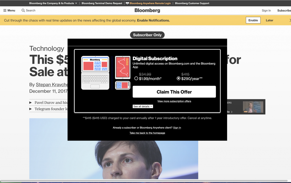
This UI is a hot mess:

Got hit with an annoying yellow alert screaming at me as well as an obnoxious subscription modal that has a lot of weird shit happening within.
For starters it’s extremely disruptive. The design is chaotic (evil). And what kind of pricing choice is this? I can choose $1.99 a month or, inexplicably, $290 a year. You have to click around and read the gray print to realize it’s a 3-month offer.
No way I’m paying for Bloomberg though because, among other reasons, The Big Hack.
